
There Is No Best Managed ISA
That might sound like a cop-out, but it is genuinely the right starting point. A managed ISA is a wrapper where someone else picks the investments for you, usually based on a risk profile. The “best” one depends entirely on where you are in life. All of them have the feature of tax free gains no matter what the investments grow to. Read more about ISAs on the link below… or continue for the juicy bits.
Someone putting in £50 a month to get started with investing has very different needs to someone moving a lump sum out of their pension into an ISA in retirement. A 25 year old building wealth over decades can ride out the dips. A retiree drawing income from their pot probably cannot (or should not).
So rather than ranking these products, we have pulled the data together to help you understand what you are actually looking at, and what it means for you.
Part 1: The Overview
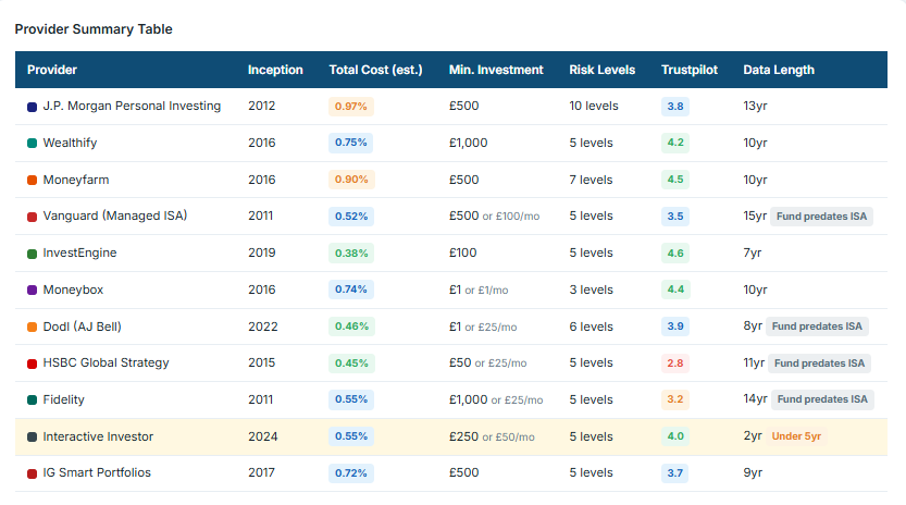
The first thing we looked at was the basics. How long has each provider been running their managed ISA? Some of the underlying funds are older than the ISA wrapper itself (ISAs only started in 1999, and the current annual allowance has evolved considerably since then), so the track record of the fund and the track record of the ISA product are not always the same thing.
We also recorded: the estimated total cost of investing (the annual charge you pay as a percentage of your pot), the number of risk levels each provider offers, and what real customers say about them on Trustpilot. None of these on their own tells the full story, but together they start to paint a picture.
Reading the box and whisker chart
This is the bit we find genuinely useful. The chart below shows the annual returns across four risk categories: Lower Risk, Medium Risk, Higher Risk, and Highest Risk. Each box represents the middle 50% of outcomes (the interquartile range), and the line through the middle is the median return.
Why does this matter? Because the tighter the box, the more predictable the return. A tight box means that most providers at that risk level delivered fairly similar results. A wide box means there was a big spread, so your choice of provider made more of a difference.
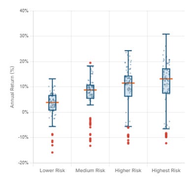
A few things stand out:
- Lower Risk portfolios cluster tightly around 3-5% median returns, but some years saw losses of 10% or more. “Lower risk” does not mean “no risk.”
- Medium Risk shows a wider range and a higher median (roughly 8-9%), but the outliers start to stretch further in both directions.
- Higher Risk and Highest Risk deliver higher medians (around 11-13%), but notice how much wider the whiskers get. The best years delivered 20-30%, but the worst dragged well below zero.
- The orange dots sitting outside the whiskers are outliers: individual years or providers that sat well outside the normal range. These are the extreme results, not the typical ones.
Explore the managed ISA interactive data here
The key takeaway: as the risk level goes up, the average return tends to go up too, but so does the range of possible outcomes. That is the trade-off. Higher expected reward comes with a wider spread of results, and that spread includes some genuinely painful down years.
Part 2: Provider Performance
The second chart breaks the same data down by provider, showing each one’s annual return distribution across their risk levels from 2016 to 2025. I’ll add the usual past performance does not represent future gains.
Every provider defines their risk levels differently. What one calls “adventurous” another might call “higher risk,” and the underlying portfolio composition behind those labels varies significantly. This chart lets you see how wide or narrow each provider’s range of outcomes actually is.
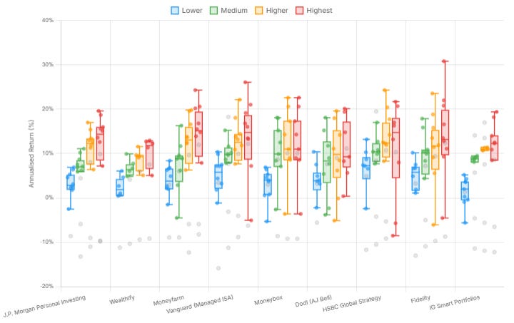
A couple of providers stand out for having too few data points to draw meaningful conclusions from: Wealthify and IG Smart Portfolios. Their managed ISA products are relatively newer to the market, so the dataset is thinner. We have included them for completeness, but take those boxes with a pinch of salt. Let’s see how they progress over the next few years
With that caveat noted, there is a striking difference in how tightly grouped some providers are compared to others.
Explore the managed ISA interactive performance data here
J.P. Morgan Personal Investing shows one of the tightest ranges across its risk levels. The boxes are compact and the whiskers are relatively short. Whether you picked their lower or higher risk option, the spread of annual outcomes has been comparatively narrow. That suggests a more controlled, less volatile set of portfolios.
HSBC Global Strategy tells a different story. The range is noticeably wider, particularly at the higher risk levels, with some strong upside years but also some sharper drops. There is more variability in what you might have experienced year to year.
Vanguard has perhaps the widest spread of all, and there is a reason for that. Vanguard’s managed ISA portfolios are not “managed” in the traditional sense. They are largely index-tracking funds assembled at different equity/bond weightings. Nobody is actively picking stocks or making tactical calls. The portfolio follows the index, wherever it goes. That means in a good year for markets you get the full upside, and in a bad year you get the full downside. There is no active fund manager trying to soften the blow. The result is a wider box, because you are essentially getting the raw market return at each risk level.
Moneyfarm, Moneybox and Dodl (AJ Bell) all sit somewhere in the middle, each with their own characteristics. Some show tighter groupings at the lower end and wider spreads at higher risk. Others are more evenly distributed.
The point here is not that one provider is “better” than another. It is that the label on the tin (lower, medium, higher, highest) does not mean the same thing everywhere. A “medium risk” portfolio at one provider might deliver a tighter, more predictable range of returns than a “medium risk” portfolio at another. Understanding that variation is part of making an informed choice.
Part 3: Fees and the Real-World Impact
Everyone’s situation is unique. That has been the thread running through this entire study, and it is worth repeating here. The “right” managed ISA depends on what you are putting in, how long you are investing for, and what level of risk is appropriate for your circumstances.
But one thing that applies to everyone equally is cost. Fees eat into your returns every single year, and over time the effect compounds. A small difference in annual charges might look trivial in year one, but over 10 or 20 years it can amount to thousands of pounds.
To show this, we have built a comparison that lets you see the impact of fees at different contribution levels: from someone putting in £50 a month as a starting point, all the way up to a £10,000 lump sum deposit with the maximum monthly ISA allocation of £1,666 a month. These are rough estimations based on the annualised return data rather than monthly figures, so treat them as illustrative rather than precise. Choose the risk rating and time period to see how fees affect the end result across providers.
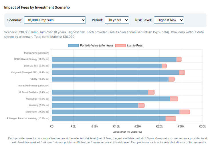
Explore the managed ISA interactive fee comparison tool here
The differences can be surprisingly large. Two providers delivering similar gross returns can leave you with noticeably different pot sizes after fees are taken into account. That is why cost matters, particularly for long-term investors where the compounding effect of charges has the most time to build up.
Reviews and usability
Performance and cost are important, but they are not the whole picture. How a platform actually feels to use, how easy it is to set up, whether the app works well, how responsive customer service is: these things matter too, especially if you are newer to investing and want a straightforward experience.
Rather than testing each platform ourselves, we have collated reviews from all providers that publish them. This gives a broader picture than any single reviewer could offer. You will find these alongside the data so you can weigh up the full package: performance, cost, and the day-to-day experience of actually using the product.
Bringing It All Together
Across the three parts of this study, we have looked at the managed ISA market from several angles. The overview gave you the lay of the land: who the providers are, what they charge, and how long they have been at it. The performance data showed you that risk labels are not standardised, that some providers deliver tighter ranges than others, and that the trade-off between risk and return is real and measurable. The fee comparison showed that costs compound quietly in the background, and over time they make a meaningful difference to the size of your pot.
There is no single winner. The right managed ISA depends on your contribution level, your time horizon, your need for risk, and how much you value a clean user experience. Someone putting in £50 a month to start their investing journey has different priorities to someone transferring a six-figure pension pot into an ISA in retirement. Both are valid. Both deserve a product that fits.
But here is the thing we do feel strongly about.
Doing something is better than doing nothing.
Even the lowest-risk managed ISA in this study, with its tightest box and most cautious allocation, has historically delivered better returns than cash over any meaningful time period. Cash ISAs and savings accounts have spent the best part of two decades failing to keep up with inflation. Your money sitting in a cash ISA is not “safe” in the way most people think it is. It is slowly and quietly losing purchasing power, year after year. A thousand pounds in a cash ISA ten years ago buys you less today than it did then. That is not safety. That is a guaranteed loss in real terms.
We understand why people sit in cash. Investing feels uncertain. The charts in this study show negative years, outliers, and wide ranges. That can be uncomfortable to look at. But the data also shows that over time, even cautious portfolios have grown in a way that cash simply has not. The risk of investing is visible on a chart. The risk of not investing is invisible, but it is no less real.
If you have money that you do not need for at least five years, and it is sitting in a savings account or a cash ISA earning a rate that barely covers (or falls short of) inflation, a managed ISA is worth serious consideration. You do not need to pick the highest risk option. You do not need to put in thousands a month. You just need to start.
The providers in this study all offer low minimum contributions. Some let you begin with as little as £1. The barriers to entry have never been lower. The only real barrier left is the decision to do it.
This study is not here to tell you which managed ISA to pick. It is here to give you the information to make that choice yourself, with your eyes open. But if we had to leave you with one message, it would be this: the biggest risk in personal finance is not picking the wrong fund. It is leaving your money in cash and watching it shrink.
For the full interactive study with all charts and the fee comparison tool, visit wiseones.co.uk/managed-isa-study
This article is financial guidance, not financial advice. Your circumstances are unique and you should seek regulated advice if you are unsure about any investment decision.