
You may have seen it doing the rounds on social media or something similar. A neat calculation. A confident claim.
“The average UK Pension pot is £32,700” “Pay in just £25 a week, invest at 10%, and after 30 years you’ll have £244,886.”
Sounds great, doesn’t it? Simple. Achievable. Inspiring, even.
There’s just one problem. It’s built on numbers that don’t hold up to scrutiny. And when people make financial decisions based on headlines that feel right but aren’t quite right, they end up disappointed. Or worse, underprepared.
So we thought we’d break it down. Not to be killjoys. But because realistic expectations are always better than optimistic surprises.
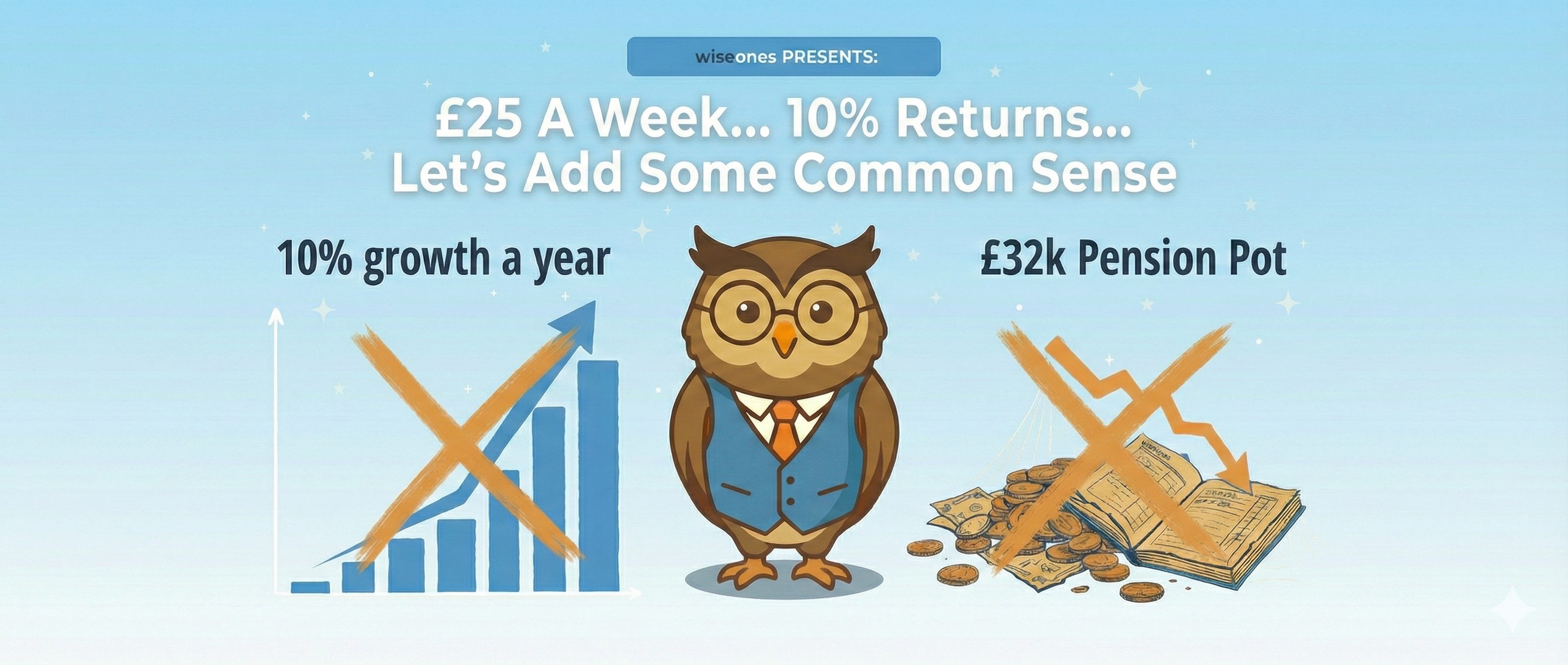
Claim 1: “The average UK pension pot is £32,700”
This number comes from the ONS Wealth and Assets Survey, published in January 2025. And it is technically correct.
But it’s also deeply misleading.
That £32,700 is the median pension pot across all age groups. It includes the 22-year-old who started auto-enrolling last year with a few hundred quid in their pot. It includes the 35-year-old who has been contributing for a decade. And it includes the 70-year-old who has already been drawing down for five years.
Lumping all of those together and calling it “the average” doesn’t tell you very much at all.
If you look at the age group that matters most for this conversation, people aged 65 to 74, the median pension pot is £145,900. That’s already more than four times the headline figure.
Even that number comes with caveats. Many people in this age bracket will have a defined benefit pension from a previous employer, even outside the public sector. That won’t show up as a “pot” in the traditional sense, but it’s still retirement income. The current auto-enrolment rules only came into force in 2012. The generation retiring right now had a completely different savings landscape to the one younger workers are navigating.
There’s also the gender pension gap. Women aged 55 to 59 have median pension wealth of just £81,000 compared to £156,000 for men. That’s a gap of 48%, driven largely by career breaks, part-time working, and caring responsibilities. For many households in this generation, it was one full-time earner and one part-time or non-working parent. That skews the data significantly.
The takeaway: quoting the all-ages average without context is like saying the average temperature in the UK is 10°C for the year. Technically true. Not very useful if you’re packing for August Bank Holiday.
Claim 2: “A comfortable retirement needs £43,900 a year”
This one comes from the PLSA Retirement Living Standards, and it’s a solid piece of research. The Pensions and Lifetime Savings Association works with Loughborough University to calculate what different retirement lifestyles actually cost. Their work is excellent.
For 2025, their numbers look like this.
One-person household: £13,400 a year for a minimum standard. That covers your basics plus a UK holiday. Not much room for anything else. £31,700 a year for a moderate standard. You get a car, an annual foreign holiday, eating out a couple of times a month. £43,900 a year for a comfortable standard. More spontaneity, longer holidays, a bit more breathing room.
Two-person household: £21,600 for minimum. £43,100 for moderate. Around £61,000 for comfortable.
Here’s the thing. The £43,900 figure that gets thrown around is for a single person living alone. Most households heading into retirement are two-person households. And increasingly, both people have been working and contributing to pensions.
That doesn’t mean you can just halve the number. Shared housing costs help, but two people still eat, travel, and live. The point is that the headline “comfortable” figure looks terrifying if you assume it all has to come from one pot. For a two-person household, you’re looking at roughly £21,500 each for the moderate standard, which is far more achievable.
Two full State Pensions at £11,973 each (2025/26 rates) already cover the minimum standard for a two-person household. That’s £23,946 combined, before any private pension kicks in.
Every household is different. Your housing costs, hobbies, family commitments, and travel plans are unique to you. Modal data, what most people actually experience, is far more useful than the outliers that make headlines.
The takeaway: £43,900 is a real number, but context matters. Your household, your circumstances, your partner’s pension. Look at the full picture before panicking.
Claim 3: “Invest £25 a week at 10% for 30 years and you’ll have £244,886”
Right. This is where we really need to talk.
Yes, £25 a week invested at 10% annualised returns for 30 years does compound to around £245,000. The maths is correct. But the assumption is doing all the heavy lifting, and it’s the wrong assumption.
Where does the 10% come from?
The S&P 500, the index of the 500 largest US companies, has delivered a historic average return of roughly 10% per year over the past century. That’s the number people love to quote. And it’s true, in nominal terms.
But nominal returns are not real returns. They don’t account for the fact that a pound today buys less than a pound did ten years ago. When you adjust for inflation, that 10% drops to around 7.5%.
And there’s another layer. That 10% (or 7% real) is measured in US dollars. If you’re a UK investor earning in sterling, spending in sterling, and eventually drawing a pension in sterling, you need to think about returns in GBP terms. Currency movements matter. Over long periods, the pound’s movement against the dollar can significantly affect what your US equity investments are actually worth to you.
Using that more realistic figure of 7% real returns, your £25 a week over 30 years gives you something closer to £135,000. Still good. But about £110,000 less than the headline claimed.
That’s the difference between feeling comfortable and falling short.
And it gets worse. Because that 10% assumes you’re betting everything on one country.
The S&P 500 is not “the stock market.” It’s the American stock market. Five hundred companies, one economy, one currency. When social media posts tell you to expect 10% returns, they’re rarely telling you to invest in global equities. They’re often telling you to put all your eggs in the US basket.
And the US has been on an extraordinary run. Over the last 15 years, it has dominated global equity returns. The Magnificent Seven tech stocks alone have driven much of the gains. It feels like US outperformance is just the natural order of things.
It isn’t. Since October 2022 the US has underperformed the rest of the world.
The world is bigger than Wall Street
There’s another index that doesn’t get nearly as much airtime on social media. The MSCI All World Index, or ACWI. It tracks large and mid-cap companies across 47 countries, covering roughly 85% of the global investable equity market. It includes the US (about 60% of the index), but also Europe, Japan, emerging markets, and everywhere else.
Over the past 30 years, the ACWI has delivered around 9.5% nominal annualised. Adjust for inflation and you’re looking at roughly 6.5% real. Lower than the S&P 500? Yes. But here’s why that might actually be the smarter number for your pension.
Markets move in long, brutal cycles
Since 1975, outperformance cycles between US and international stocks have lasted an average of more than eight years. The most recent run of US dominance stretched for about 15 years, making it one of the longest on record. But every single previous cycle of US outperformance has eventually reversed. Every one.
International stocks led in the 1980s, driven by Japan’s rapid ascent. The US took over in the 1990s during the dot-com boom. Then international stocks led again through the 2000s as China’s economic growth powered global returns while the S&P 500 went nowhere. The US stormed back from 2010 onwards, fuelled by tech dominance and a strong dollar.
And now? In 2025, the pattern has shown signs of turning again. European stocks have significantly outperformed the S&P 500 since October 2022. International equities as a whole outperformed US stocks by roughly 17 percentage points in 2025.
Nobody rings a bell at the top or the bottom. But history tells us that the leadership always rotates.
The “lost decade” is the cautionary tale everyone ignores
This is the bit that should keep S&P 500 purists up at night.
From January 2000 to December 2009, the S&P 500 delivered an annualised return of negative 0.95%. Not low returns. Not disappointing returns. Negative returns. For an entire decade.
If you had invested $1 in the S&P 500 on 1 January 2000, you would have had 91 cents left by the end of 2009. Factor in inflation, and the loss of purchasing power was over 37%. That’s after the dot-com crash, 9/11, the Iraq War, and the global financial crisis all piled up within the same ten-year window.
But here’s the part the US-only cheerleaders leave out. During that same decade, international stocks actually made money. The MSCI World ex-USA ended the decade up roughly 22% on the same dollar invested. International small-cap stocks returned over 190%. Emerging markets roughly doubled. If you had been diversified globally, your portfolio would have looked completely different.
The league table from 2000 to 2010 is almost the exact mirror image of the one from 2014 to 2024. What’s winning now was losing then. What was losing then is winning now. And in another ten years, it will likely shift again.
Why this matters more for pension savers than anyone else
If you’re investing for fun with money you don’t need, by all means, back your conviction. Pick a country. Roll the dice. See how it goes.
But a pension is not a punt. It’s money you are relying on to live. You cannot choose when you start working and you cannot always choose when you retire. Your 30 or 35-year investing window is fixed by your life, not by the market cycle.
If your entire pension sits in the S&P 500, and your working life happens to coincide with a period of US underperformance, you’re exposed to a single-country risk that could fundamentally alter your retirement. The person who started saving in 2000 and retired in 2012 had a very different experience from the one who started in 2010 and retired in 2024. Same index. Same contribution rate. Wildly different outcomes.
A global index like the ACWI gives you the US (it’s still the largest component by a long way), but it also gives you everything else. When one region struggles, another often picks up the slack. The headline returns are a bit lower, but the range of outcomes over any given 30-year period is narrower. The ride is smoother. And for someone who absolutely must access their money at a specific point in time, that smoothness matters far more than chasing the highest possible average.
Think of it this way. A steady 6% real is something you can plan around. A volatile 7% real that might actually be 0% if you draw the wrong decade is not a plan. It’s a hope.
Those of us who remember 2001 to 2012 know this instinctively. It was not a golden era for equities, especially US equities. The dot-com crash, the financial crisis, and a painfully slow recovery meant that anyone who started investing at the beginning of that period and needed to access their money at the end had a very rough ride. The same was true in the 1970s, when inflation ravaged real returns across most markets.
There have always been periods of underperformance, and you cannot know in advance when your working life will coincide with one. If you happened to derisk your pension in 2000 or 2008 you would be sitting pretty. If you derisked in 2012 you missed the following boom years. The difference in outcomes is enormous, and none of it was within your control.
Diversifying globally doesn’t guarantee you’ll avoid the bad times. But it significantly reduces the chance that one country’s bad decade becomes your personal catastrophe.
So what does the maths actually look like?
Let’s work through a more realistic example.
Take someone starting at age 30, working to 65. That’s 35 years of contributions.
The median full-time salary in the UK is around £37,500. If they’re in a workplace pension with the minimum auto-enrolment rate of 8% of qualifying earnings, that’s roughly £250 a month going in (combining employee and employer contributions).
Using the S&P 500’s inflation-adjusted long-term return of around 7%, that monthly contribution over 35 years grows to approximately £484,000.
Using a global equity figure closer to 6% real (more in line with the MSCI ACWI after inflation), the same contributions grow to around £350,000 to £380,000.
That’s a meaningful difference. But notice something. The global figure is still enough to fund a moderate retirement for a single person alongside the State Pension. You haven’t given up on a decent retirement. You’ve just planned for one that doesn’t depend on America having another record-breaking run.
And here’s the good news: based on current annuity rates of around 7.5% for a healthy 65-year-old, even that more conservative pot could generate roughly £26,000 to £28,500 a year of guaranteed income. Add the State Pension on top (£11,973 for 2025/26) and you’re almost within the moderate standard for a single person by paying the bare minimum.
If the markets deliver closer to the S&P’s historic average, wonderful. You’ll overshoot your target. That’s a much better problem to have than the alternative.
But, and this is a significant but, that 7.5% annuity rate is a snapshot of today. Annuity rates move with gilt yields and life expectancy assumptions. They might be higher or lower when you actually reach retirement. And any return figure, whether 6% or 7%, is still an average across good periods and terrible ones.
The bit nobody wants to hear (but everyone needs to)
If you’ve hit your target pension pot, congratulations. But the journey doesn’t end there.
You broadly have two choices. You can take the market risk off the table entirely. Buy an annuity, lock in a guaranteed income, and sleep well at night regardless of what markets do next.
Or you can stay invested. Split your savings into time horizons. Money you need in the next ten years goes somewhere safe. Money you won’t touch for a decade or more stays invested in growth assets where it can continue to compound.
Neither approach is wrong. But they suit very different people in very different circumstances.
Someone with a pot of £1 million and annual spending of £10,000 has a completely different capacity for loss than someone with £100,000 and annual spending of £7,500. They might use the same investment platform, the same funds, even the same adviser. But their risk profiles are worlds apart.
This is one of the reasons why blanket social media advice can be actively harmful. Your situation is not average. Your needs are not generic. And a viral post with a compound interest calculator is not a financial plan.
The Wiseones View
We are absolutely in favour of encouraging people to invest. Everyone should be investing for their future. Full stop.
But encouragement needs to come with realistic expectations. Quoting 10% returns without adjusting for inflation is not realistic. Telling people to pile into a single country’s stock market without mentioning that it has delivered negative returns for an entire decade within living memory is not responsible. It creates a false sense of security that can lead to undersaving, because people think they need less than they actually do.
A globally diversified approach, something like the MSCI All Country World Index, won’t give you the bragging rights of the S&P 500’s best years. But it will give you exposure to the whole world’s economic growth, not just one country’s. When the US stumbles, other regions often pick up the slack. That matters enormously when your retirement depends on the outcome.
Using conservative assumptions will always serve you better. If you plan for 5% real returns and get 7%, wonderful. You’re ahead. You’ve got options you didn’t expect.
If you plan for 10% and get 6%, you’re staring down a retirement that looks very different from the one in your head.
Lower your expectations. Be more conservative with your projections. Diversify beyond the headline index. Because in the long run, it is always better to be surprised on the upside than caught out on the downside.